top of page
SARAH AHMAD
creative director • writer • creative strategist • brand builder
ASUG: Brand Refresh
The ASUG brand was scattered, inconsistent and lacking presence. Through research, interviews with members and stakeholders, clean design and clear communication, we emerged with a cohesive, memorable brand that was rooted in the brand's pillars of learn, connect and grow.

Before
Inconsistent logos, dull color palette, there were a plethora of issues that needed to be addressed.
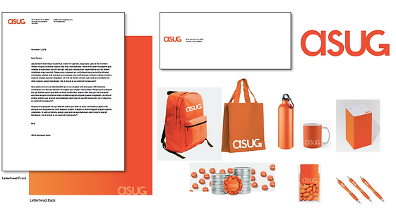
After
A cohesive, modern brand rooted in signature ASUG orange across all touchpoints.

After
A welcoming home page with original photography, clean navigation and custom iconography.
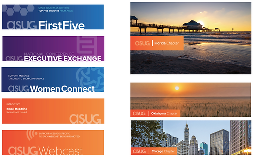
After
A system that works across all brands needs, mixing photography with bold color and graphics for a clean, eye-catching communication that resonates with members.
bottom of page